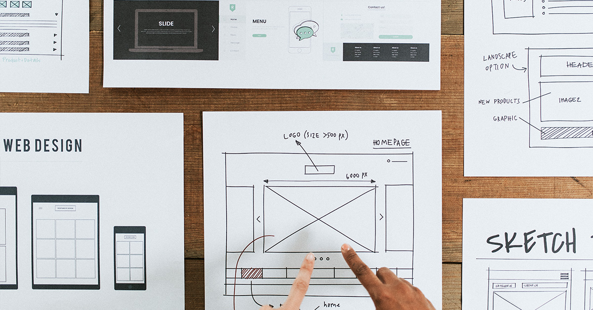
Responsive Web Design
With the increasing use of mobile devices, it’s important to ensure that websites can adapt and provide a seamless experience across different screen sizes and resolutions. In this blog, we will explore the three key elements of responsive web design that can help create user-centric websites. So, let’s dive in and discover how these elements contribute to an enhanced user experience.
Responsive web design addresses these challenges by adapting the website’s layout, content, and functionality to fit different screen sizes. By embracing responsive design principles, businesses can provide a seamless user experience, regardless of the device being used.

Element 1: Fluid Grids For Flexible Layouts
Traditionally, websites were built using fixed-width layouts, which worked well on desktop computers with standard screen resolutions. It is one of the fundamental elements of responsive web design. Fluid grids, on the other hand, allow website layouts to adapt dynamically based on the screen size. Instead of defining elements with fixed pixel values, fluid grids use proportional units such as percentages.
By implementing fluid grids, designers can create flexible layouts that automatically adjust and reposition elements, maintaining a harmonious balance between content and white space.
Element 2: Media Queries For Device Adaptation
Media queries allow designers to apply different stylesheets or CSS rules based on specific device characteristics such as screen size, orientation, and resolution. This capability enables websites to adapt their appearance and behavior to provide an optimal viewing experience on each device.
By leveraging media queries, designers can customize the presentation of the website for various devices, ensuring that users have a consistent and enjoyable experience. Media queries also play a vital role in optimizing website performance. By selectively loading or excluding certain assets based on device capabilities, websites can minimize unnecessary resource consumption and enhance loading speeds. This results in faster page load times, reducing the risk of visitors abandoning the site due to slow performance.
Element 3: Flexible Images And Media
The third element of responsive web design involves the proper handling of images and media.
Images are an integral part of websites, and they can significantly impact the overall user experience. However, if not optimized for different devices, images can slow down page load times and consume excessive data, especially on mobile networks. By incorporating responsive image techniques, websites can optimize image loading and reduce bandwidth usage. This not only improves performance but also ensures that images look crisp and clear on all devices, enhancing the overall visual experience for users.

Need Professional Website Developer And Designer In Salt Lake City?
Discover the future of web design with our expert team. Contact Crunchy Lemons today and let’s craft a bespoke website that mirrors your vision and surpasses your goals. Elevate your digital brand today!
